
Many small business websites have a hidden issue that quietly creates extra work, unnecessary costs, and a less professional appearance over time: the lack of a structured brand guideline color palette. It’s not always obvious at first glance. The layout may look fine and the content may be solid, but underneath the surface, there is often no clear system for how colors are used across the site.
Instead, colors are chosen one at a time as new sections, pages, or features are added. Over time, this leads to a buildup of slightly different shades, inconsistent styles, and a website that becomes harder to manage with every update. This is one of the most common problems we see when working with small businesses, and it is also one of the easiest to fix with an intentional approach to your website’s visual identity.
What is a Brand Guideline Color Palette?
A brand guideline color palette is a formal, structured system that defines exactly which colors represent your business identity. Rather than a random collection of hues, it is a deliberate selection of primary, secondary, and tertiary colors. This system includes technical values like Hex codes (for web), RGB (for digital screens), and CMYK/Pantone (for print) to ensure your brand looks identical whether it is on a website button or a printed business card.
Why a Structured Color System Saves Your Business Money
When colors are not managed intentionally, two things happen. First, the website looks inconsistent; one shade of blue on a button, another in the footer. Most visitors won’t consciously notice, but they will feel it. This inconsistency subtly impacts the first impression of your business, which can damage trust.
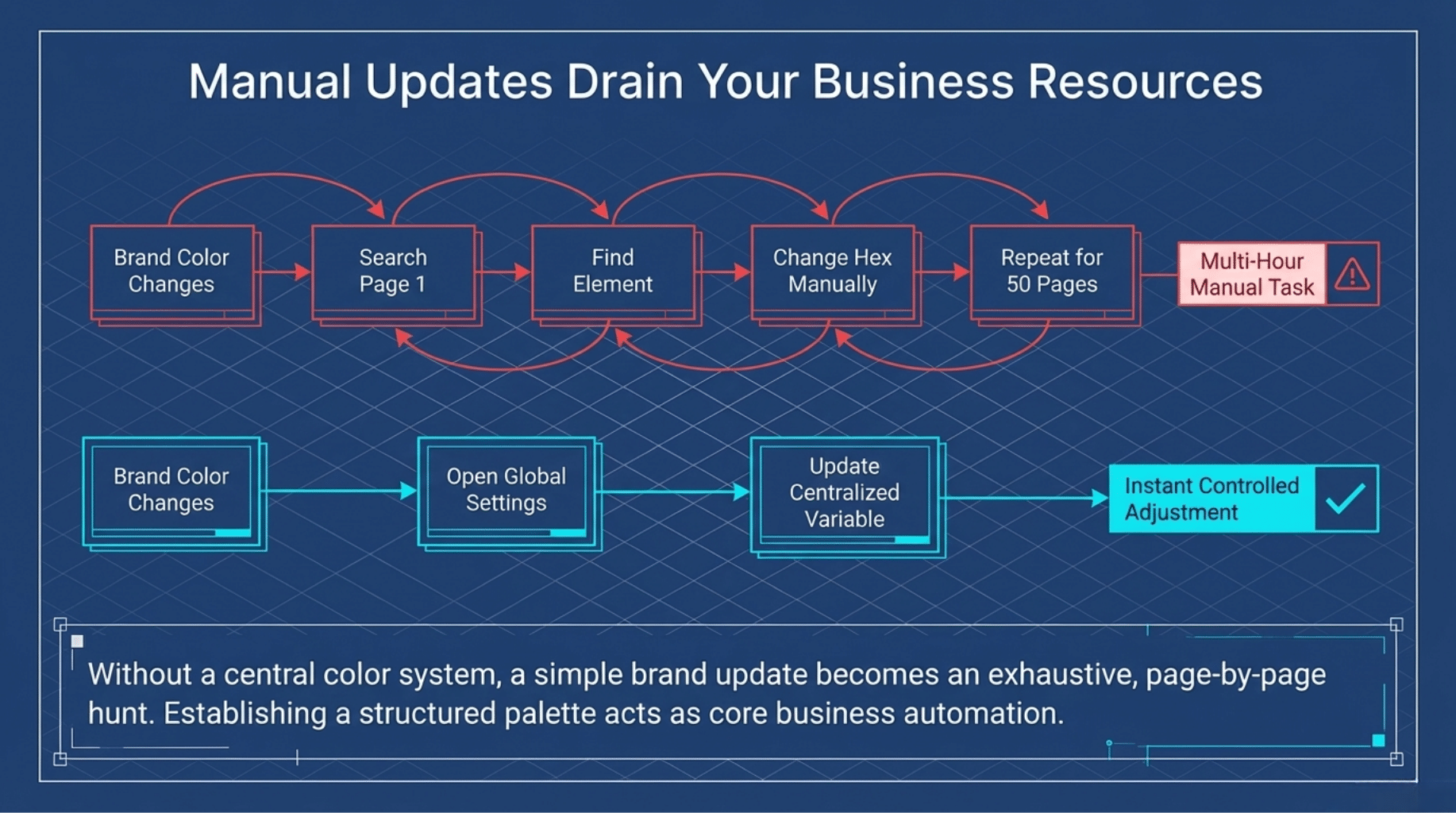
Second, updates become time-consuming. If your brand color changes, there is no central place to make that update. Instead, someone has to find and replace each color manually across every page. By establishing a professional brand guideline color palette within your website structure, you turn a multi-hour task into a quick, controlled adjustment. This efficiency is a core part of broader business automation services that save small business owners significant time and resources.

The 60-30-10 Rule: A More Efficient Approach
A better approach is to treat website colors as a system. Professional designers often use the 60-30-10 rule to maintain balance:
- 60% Primary Colors: The dominant hues used for your base and background “canvas.”
- 30% Secondary Colors: Supporting colors that add variety and depth.
- 10% Accent Colors: High-contrast shades used sparingly for things like “Call to Action” buttons.

Tie every element back to these core choices. When your core color changes, everything else updates with it automatically, ensuring your site always maintains a cohesive, high-end look.
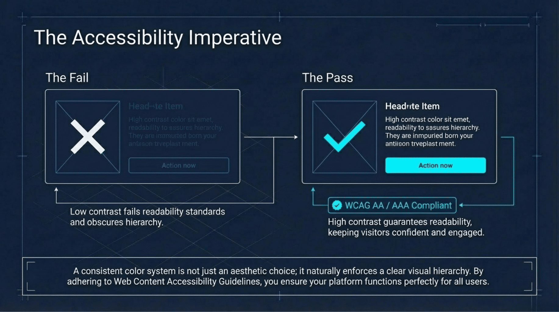
Why This Matters for Design and Accessibility
A consistent brand guideline color palette contributes to a clearer visual hierarchy and ensures color accessibility. By maintaining high contrast between text and backgrounds, adhering to Web Content Accessibility Guidelines (WCAG) standards, you ensure your site is readable for all users. This intentionality helps guide visitors through your site, keeping them engaged and confident in your professional services.
Frequently Asked Questions
How many colors should be in a brand guideline color palette?
Most professional guidelines recommend a specific range, often starting with 1–3 primary colors and 1–6 secondary or accent colors. Including a few neutral shades (whites, greys, or blacks) is also essential for balance.
What is the difference between a primary and secondary color?
Primary colors are the core hues representing your logo and identity. Secondary colors support them to highlight specific user interface (UI) elements or distinct sections of your content.
The Bottom Line
A well-designed website is about how easy it is to maintain and update as your business evolves. By organizing your colors into a simple system, you create a site that stays consistent, builds trust, and saves time.
Want Help Improving Your Website?
If your site feels difficult to update, your underlying structure likely needs a refresh. We help small businesses build websites that are visually strong and easy to manage day-to-day.
Before making any changes, ask yourself: If you needed to change your website’s main color today, how long would it take you? Your answer will tell you if your site is working for you or creating extra work behind the scenes.